“Graphic Life of Henrietta” Pecha Kucha Project

Title: “The Graphic Life of Henrietta”

This is my City of Rhetoric presentation of the Graffiti I found around Henrietta in Rochester, New York.  I used one of the Kodak Easy Share cameras to take pictures around the area of Rochester.  I first used GIMP to put together two of my photos, Powerpoint to help time my recordings, and then used that to upload my pictures onto iMovie, where I edited, cropped the images and made the final recording, using a Logitech USB headset.

Originally I called this “From A Spray Can” but I thought “The Graphic Life of Henrietta” was a much more fitting title, a play on words with Graffiti.  The transitions of the slides are meant to be like a new coat of spray paint being put on and the sound effects (Provided by me because of a lack of a spray can option) to signify the transition, which I tried to lower down so it would not drown out the sound of my own voice.  This is supposed to be speculative onto what the purpose some of this art provides and give some background information on what Grafitti artists do and what is suggested of them, and just to just show what sort of art can be found in a small neighorhood.

What It Means:

It is meant to show what styles of graffiti can be found in Henrietta and what are the possible motivations for those works.  The order of which I decided as a bit of a travelogue putting people through the journey just like I did when taking the photographs.  I use a spray transition in order to give the video a feel equivalent to the

Strengths and Limits:

I believe this piece is strong in trying to present how street art is used in Henrietta.  However it may feel incomplete or not cover enough of the styles.  Had I gotten more time to take photos I would have fit in some more photographs, probably similar ones in a collage of sorts to cover some of the same ground.

What I Learned:

Basically that being able to present a cohesive narrative in under 6 minutes and 40 seconds is kind of hard work, you must be prepared to have enough information to fit in that time and make sure it is relevant to the discussion.  As well the pictures have to compliment your points otherwise they might feel disjointed in narrative.  I also learned that outside of overpasses and  abandoned buildings people are trying to keep things clean around Henrietta.  Street art is not something that can be done anywhere, people are selective about where they spray and have to be careful if they don’t run into the law if they don’t intend to.

Process Notes

-Inspired by the directions given on the Pecha Kucha video slide, as well as the Motion Image Essays such as Las Vegas & Reno and Tokyo Love Hello.

-In terms of course work I was inspired by Foss and “Idelogical Criticism” as well as David Fleming and his word on how specific structures are built as well as the intent there is behind them.  How deep I must look into the pieces of art, and what purpose do they serve?  Inspired me to be speculative with a lot of my work.

-Chapters 2 and 4 of Picturing Texts gave me some inspiration as I looked closer at the grafitti and how I consciously photographed them in order to represent them properly as art on a overpass.

-I got interested in photographing graffiti after a conversation with Prof. Hunter’s class pulling around ideas for Pecha Kucha projects.  I also knew the neighborhood had quite a bit graffiti so I used that exposure in order to build the project.

-Taking the pictures was a bad ordeal as I had to deal with sleet possibly ruining my camera, thus why some of my pictures are taken within the car.

-I uploaded my photos onto my laptop and then organized them in what order I wanted, as well as putting two together through GIMP.

-I used my cell phone and a script to time each line I had in order to see if it would fit in under 20 seconds.

-With the photos in powerpoint, I tried to record my narration through Audacity, a free audio recording/editing software, however and exported it to a WAV on my laptop to use in iMovie.

-The process of which timing my photos on iMovie was easy and using a spray-paint like transitions was at this point I decided to do.  However matching up the audio was not, as it turned out I had ran my audio longer than the slides without even thinking.  I tried to rectify this by editing in Audacity but it turns out I could not export any WAVs on an Apple computer.  I tried to use Dropbox in order to use the files at home but there is a glitch in which it would not read all my audio files that I have recorded.  What’s more I could not use my iMovie files in other Apple computers.

-Peer Responses: My peers thought there was more I could do to expand upon the project, find more surfaces which are sprayed, more places like Park Avenue and the side of trains.  As well as incorporate more of a discussion as to why people do these things, spray overpasses and such.  It was my professor Rik Hunter that thought that the “Suck Up” kind of looked like an F thus looking like “Fuck up.”  About the only advice I had taken was Rik’s but I was inconvenienced with time so I decided to just work around what I had.

-I decided to scrap whatever project I had and started from scratch, this time using the internal iMovie software to record my dialogue, and deciding to make the spray can sound effects to make a cooler transition.  While it is not a continuous recording, the project was able to get in under 6:30, I have no idea why it’s 10 seconds shorter than the actual one but I did time it as instructed.

-I uploaded all my files to YouTube, which I have an existing account, but decided to make it unlisted so not anyone could see it only those who have the link.


Leave a comment

April 21, 2012 · 7:59 pm

Learning Log #12: This is the End (Almost…)

“The End” performed by The Doors, property of Elektra Records

Posted on Youtube by: SloLord

We are going into the final week of Visual Rhetoric class and it most certainly has been a diverse experience.  How we’re getting close to the portfolio work though makes it feel like there is much that still needs to be done.  The semester may be winding up yet I feel like there is still much more to be done.  If anything my feedback from my rough presentation of my City of Rhetoric assignment has taught me, even when it feels close to the end, there are still things that can be done.

The challenge I have faced with myself is getting the project as perfect as I possibly could, and making sure that the people who would watch would understand the concepts that I am trying to convey.  At least the active discussion we had on the Jackson and Sturken readings about architecture have given us a good direction by which our peers could really take a look at how things are presented visually, and if there was more to explore.  I do find it satisfying when people do see what areas I could explore in more detail like why do people graffiti overpasses or more surfaces by which I could find more graffiti like on trains or explore more of the city of Rochester.  I have looked up a few ideas by last minute although something like the Legal Wall is not a possibility considering I just found out it has been closed off due to some artists going outside of the area.  Rik Hunter’s idea of one of my photos (see above) saying “fuck up” as opposed to “suck up” or “suck it out” was funny though, I didn’t consider that.

In our group discussions I think what I find similar and different at the same time is how we have found out particular style, nothing quite overlapping with each other.  Danielle taking a look at “third places” mainly dealing with cupcake shops, Julia’s covering of Religious spaces interesting how many different churches and synagogues can be so different in subtle ways from the seating to the windows, and Erik Johnson’s trip through Rochester Music Venues have a good background to them, he really has done well with his research.

I think a difficult thing I have found and I think the rest of us have is finding enough things to say.  Sometimes we think we do, but at times it can overrun what we are trying to say or at times fall a bit too short.  It is difficult to find the right information to fit within 20 seconds per slide, and if I will be able to make it all work in the end.

I think what changed my ideas of how much content should be in a presentation is actually going through and narrating the slides.  I feel I may have only skimmed some of the surface of the subject I am working on.  As I have previously written finding a lot of information about the subject has not been an easy task, but is necessary to complete this as best as I can in the small amount of time that I have left in this semester.  I do think I am strong at narrowing down a speech to fit a 20-second a slide presentation, if there is any strength my presentation this past class has shown.  I learn at the very least I present my material with a lot of confidence, if only I could do more than just a few locations around Henrietta.

If anything this experience is making me learn is that nothing is ever done, we can think we’ve got something complete, but there will always be room for improvement.  Newspaper editors might reject articles because they don’t have enough research or fit the word count, and from what I’ve experienced with my editing work of my novel that there are still ways I should perfect my own work.  I should be prepared to work feverously to make sure whatever I present can be as perfect as it can, when I pursue an author or newspaper career.

Only one full week of classes and an exam week to go, there are still things to be done.

Learning Log #12: This is the End (Almost…)

I think to summarize my experience in this class is that I have known more about Visual Rhetoric than I thought I would.  While I did expect a course along the lines of Rhetoric of Hate class, I did not quite prepare myself for some of the extent in which we have worked during this semester.  Now here I am at the end of the last week of classes, and with a Portfolio to do and present for Exam week this oncoming Monday, I am going to have to put my skills to what I have learned to the test.

The challenge of the course thus far has been trying to make sure everything I have tried matches up to the expectations of what goes into something that can be considered Visual Rhetoric.  I have done Photoshop, I have done video editing, I have even made my own charts before, but they are to be made to a standard that challenged me more than it ever has in the past.  However to hear the people compliment the work I have done, to see where I can improve, how I can make my work the best they can be is always something satisfying.

I always feel I might have half-assed an assignment in a certain way or not done enough, but seeing what others have done, they are in much of the same ship that I am.  We are always striving to know what can be done to help improve our skills; to see what others think can improve upon our work, no matter what changes they may entail.  The difference I see is that students don’t feel as down on themselves like I did, and feel there is still time to do everything.  I admire them for that; I wish I had that optimism.

I think the current City of Rhetoric project is probably a latest instance where the difficulties of combatable software or data absolutely frustrated me.  In spite of all that I tried to save through Dropbox, usually when I try to upload them to a computer there is either a glitch that prevents me from opening them or the files don’t even show up at all, like the files on iMovie.  I ended up having to redo the whole project as well as re-record my whole lines just because the files would not work properly.

I think what changed my thinking with using Pecha Kucha is that it is better to try and pace you with the presentation rather than make everything all at once.  What changed is when I kept trying to do the presentation in all in one breath, that sometimes it would be better just to do the slides differently, to cohere your ideas clearly and make sure you don’t have to stumble over your words that often.

As I have specified I am a person with not a lot of self-esteem, not taking my own work as the absolute best at times and always want to see what I can do better.  I always feel I need feedback, to see if I am doing something right or presenting my ideas clearly.  However I think I am stronger than I can give credit for, that my work can still be seen by others as golden even when I don’t.  What I do is fine and that I should not short-change just because I feel the experience is bad.

The importance of knowing what your strengths and what your weaknesses are is definitely something that careers are based upon.  There should be a middle ground not get too confident to end up feeling blind to what your flaws are and don’t be so down that you will just give up.  You’ll be able to make something of yourself through experience, be better at making posters so you could be great at visuals in a market based carrer, be better at making videos to illustrate a point at a meeting or online, and show the world what you are through your work.

Of course I want to be a journalist and I want to be an author, but I also want to be someone who can use visuals to help explain myself.  This course has taught me how much goes into visuals and how they are interpreted, what I have learned will help me move forward in presenting myself.  Give an impression not only by my words but what I can show as well.

Visual Rhetoric has given me the confidence to find what I need to do to expand myself in ways I didn’t think of.  I hope that it has for the rest of the class as well, wherever their careers may lead.

I’m not out of the woods yet, one more class to go.

Leave a comment

Filed under LL, Visual Rhetoric

Learning Log #11: Pictures Falling into Place

Does this say "Suck Up" or "Fuck Up"? You decide. Photo taken by Me

We are going into the final week of Visual Rhetoric class and it most certainly has been a diverse experience.  How we’re getting close to the portfolio work though makes it feel like there is much that still needs to be done.  The semester may be winding up yet I feel like there is still much more to be done.  If anything my feedback from my rough presentation of my City of Rhetoric assignment has taught me, even when it feels close to the end, there are still things that can be done.

The challenge I have faced with myself is getting the project as perfect as I possibly could, and making sure that the people who would watch would understand the concepts that I am trying to convey.  At least the active discussion we had on the Jackson and Sturken readings about architecture have given us a good direction by which our peers could really take a look at how things are presented visually, and if there was more to explore.  I do find it satisfying when people do see what areas I could explore in more detail like why do people graffiti overpasses or more surfaces by which I could find more graffiti like on trains or explore more of the city of Rochester.  I have looked up a few ideas by last minute although something like the Legal Wall is not a possibility considering I just found out it has been closed off due to some artists going outside of the area.  Rik Hunter’s idea of one of my photos (see above) saying “fuck up” as opposed to “suck up” or “suck it out” was funny though, I didn’t consider that.

In our group discussions I think what I find similar and different at the same time is how we have found out particular style, nothing quite overlapping with each other.  Danielle taking a look at “third places” mainly dealing with cupcake shops, Julia’s covering of Religious spaces interesting how many different churches and synagogues can be so different in subtle ways from the seating to the windows, and Erik Johnson’s trip through Rochester Music Venues have a good background to them, he really has done well with his research.

I think a difficult thing I have found and I think the rest of us have is finding enough things to say.  Sometimes we think we do, but at times it can overrun what we are trying to say or at times fall a bit too short.  It is difficult to find the right information to fit within 20 seconds per slide, and if I will be able to make it all work in the end.

I think what changed my ideas of how much content should be in a presentation is actually going through and narrating the slides.  I feel I may have only skimmed some of the surface of the subject I am working on.  As I have previously written finding a lot of information about the subject has not been an easy task, but is necessary to complete this as best as I can in the small amount of time that I have left in this semester.  I do think I am strong at narrowing down a speech to fit a 20-second a slide presentation, if there is any strength my presentation this past class has shown.  I learn at the very least I present my material with a lot of confidence, if only I could do more than just a few locations around Henrietta.

If anything this experience is making me learn is that nothing is ever done, we can think we’ve got something complete, but there will always be room for improvement.  Newspaper editors might reject articles because they don’t have enough research or fit the word count, and from what I’ve experienced with my editing work of my novel that there are still ways I should perfect my own work.  I should be prepared to work feverously to make sure whatever I present can be as perfect as it can, when I pursue an author or newspaper career.

Only one full week of classes and an exam week to go, there are still things to be done.

Leave a comment

Filed under LL, Visual Rhetoric

Reading Response #9: Architecture and the City of Rhetoric

The Vietnam War Memorial, Photo by: Skyring, use protected under Creative Commons

According to part of Nancy Jackson’s conclusion on her article “The Architectural View: Perspectives on Communication” someone interesting in Architectural writing would think of these questions:  “The content of the architecture… understanding the process… and enlarging the span of possible work.”  According to her Architecture isn’t a field that has been popularly studied but has about as much merit as studying a photograph or a neighborhood.  Marita Struken’s piece on the Vietnam War Memorial is exactly what the sort of study Jackson is talking about, taking a look at the War Memorial as it is designed and what sort of history is behind it.

Just like a neighborhood discussed in the last Reading Response, there is a method behind designs of architecture, the materials by which they are made of, the size as in how much space it would occupy and what it is meant to support, and if there is a specific intention behind it.  A tall glass window building might be to support an industry, with offices and other rooms built to support many workers.  A castle might be built tall to ward off intruders.  Apartment complexes are designed to house many people.  The Vietnam War memorial may look bleakly black because the war was not one that has been celebrated well, to give a victorious sort of memorial would not fit the tone of the war. Having been to the memorial myself, I can distinctly feel that it was not one in which it was celebrating the war, just honoring those who died.

It is clear that there is some sort of thought process at work designing structures or buildings, and sometimes can be speculated like the Washington Monument as read phallic.  Analyzing architectural structures like analyzing neighborhoods is not far away from looking at texts, looking at people’s lives, or how arguments are pictured.  How a building is designed, has the same thought processes and ties into how we look at the designs of visuals, the reasoning behind why things are a certain way.  One might be to house different kids or, to use a fictious example, might be designed to be a gateway to an ethereal being who would bring about the end of the world.

Part of what we look at in City of Rhetoric is why specific structures are made the way they are.  Taking a look at the study of architecture and the history of buildings are constructed is important to know how we evaluate the imagery that we photograph.  Even with my graffiti project, it’d be interesting to know why some places are chosen, what sort of impact they will leave to the viewer and how their structure is important.  Having their art being exposed can definitely tell why there is a lot of graffiti on overpasses, meant to carry cars and put people through traffic, a perfect place to get your message out.  One person’s design can be another’s art.

Leave a comment

Filed under RR, Visual Rhetoric

Learning Log #10: “Objectified”, our material world, and our assignment

The movie we watched this past class Objectified came from the same person that did Helvetica Gary Hustwit.  Both do share similarities in style and commentary, whereas Helvetica is about texts Objectified is more about design.  To paraphrase the words of one person in the documentary “everything has been designed one way or another” and a Henry Ford quote “Every object tells a story.”  An apt film to be a companion piece with our City of Rhetoric assignment, if there ever was one, how we are going to understand the objects in which we study is exactly what the objective is.  Looking at graffiti would be a part of understanding design.

I expected the assignment around this time to have things tied directly, and it didn’t surprise me all that much that the film was dealing with what we were planning.  I didn’t entirely expect David Fleming to dominate the discussion as much as he did, I thought Foss would have been a much more interesting but I guess I underestimated that importance.

To put what my challenge is that key idea on what you wanted to document, and if it was feasible to do.  When I had taken my photographs for the assignment, I had to deal with rain, sleet and placement of where would be a possible place to shoot rather than break some sort of laws in order to get to it.  As well finding exact definitions for graffiti was not an easy task as I didn’t quite find as much information as to the many different styles as I thought I would.  This probably has got to be some of the more challenging aspects I have done in the whole course, and I would have done more had the weather been better.

However, I got much satisfaction in that I was able to pull through with photographs that could be used in a final Pecha Kucha, and that speculation would be alright since we don’t know everything there is to know.  My camera may get a little wet but the results would be worth it.  This has what has most changed is the motivation, a lot of what we do is perception and if there is anything deeper, it can be up to us to present it in a good fashion.

The active discussion on visuals and how things are designed had a slow start, but surely everyone started to throw in, mainly about how neighborhoods can suffer from some new design enforced and how it would push out poor people.  Strangely it runs right into one of my fellow Senior Seminar’s students on how reconstruction efforts been perceived by the media.  As well I am personally opposed to the ideas that building a large structure, walling off sections of the neighborhood or building a ferry from Rochester to Toronto will solve struggling neighborhoods problems, it may only be good for the more affluent not so much the people who are poor and living.

While I feel I have gotten the hang of the project, there is still much more to be done though.  There has to be more Graffiti descriptions than the ones I have done, I feel maybe I’ve only skimmed the surface.  Search Google for every possible avenue, I don’t quite take a long look at everything, so I have trouble making it through with rough drafting narration.  However, I do think I have gotten an easy start, I am already familiar with video editing software and recording voice over, and so I will try to give the street art justice as much as I can.

If anything understanding how things are designed would help how I am going to find a way to incorporate some fresh ideas into how I am going to present my story.  I am seriously considering a digital avenue, but what more can I do?  What more could I make of it, beyond just having words?  How will it be read?  Right now, I am in a stage in which there isn’t an end goal but when the time comes I would want to show my ideas to the world and be conscious on how I can truly express them.

Leave a comment

Filed under LL, Visual Rhetoric

Reader Response Blog #8: Ideological Criticism and the City of Rhetoric

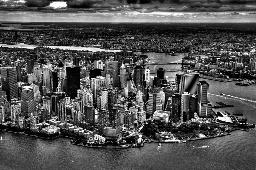
What can New York City say about itself? "Dark City" by Nosha, image use protected by Creative Commons

I became familiar with the idea of Sonja Foss’ descriptions of Ideological Criticism through Arthur Asa Berger’s book Media Communication and Research Methods which devotes a whole chapter to the research method.  Foss describes that ideologies are “a pattern of beliefs that determines a group’s interpretations of some aspect(s) of the world” reflecting “a group’s ‘fundamental social, economic, political or cultural interests.’” (Foss, pg. 209).  The Ideological Criticism is looking at these through a different cultural lens, whether it is Marxism, feminism or hegemonic to give an example, like what she talks about in the invasion of Iraq.  Then there is what David Fleming wrote on how cities are designed and structured, different ideas of how a great city can be, if separate communities can mean a good community.

This was an interesting idea when we had discussed it in Senior Seminar and really makes me think of how we can take things visually to a more research induced level.  If we look at specific architecture in a different lens and how visual designs are formulated then we can better understand how they were made.  What that lingerie billboard ad might mean towards feminists or what a tattoo can mean to someone who knows what symbols mean.

With visuals that can be read anywhere I do not feel all mean with a specific intent by the designer.  A person making an ad for Sony PlayStation Portable for example might not be aware of the racial implications of loud talking squirrels.  Is there an ideology at work that can be read as simple or just a case in which the advertisers did not know what the hell they were doing?  Would it match with what would be with Foss’ wordings?

Regardless these readings can be tied back to what we have talked of in the past, how visuals discussed in Chapter 3 of Picturing Texts can express someone’s personal ideology, ideologies can argue about something like suggested in Chapter 6, can use provocate pictures for an argument as well, looking closer in Chapter 2, and all the way back to Chapter 1 how things are framed, all might have an Ideology and intent behind them.  Much what we see visually can be traced back to whoever designed it, and what their beliefs are.  How photography, art, video, advertising, etc. can be seen into and traced back to a specific set of beliefs.

This is important for our City of Rhetoric assignment because discussing 20 pictures for over 6 minutes you must be able to provide more background for whatever you are writing about.  My Graffiti project for instance would have a great deal of look into the various styles of this street art to make a deeper meaning of what they mean beyond just how they appear to be.  Rochester is definitely a city that can be seen from an ideological standpoint and I can’t wait to see what people can draw from it.

Leave a comment

Filed under RR, Visual Rhetoric

Learning Log #9: Pecha Kucha and Visualizing Rochester

A guide to do a Pecha Kucha

Source: Wired News

Most of what we covered on this past class was the upcoming assignment of the City of Rhetoric and how we would visualize Rochester.  I would have expected it to be a thing where we would photograph specific objects and make a video diary about them but it would have to be a bit more complete than that.

The challenge was to think of an idea that would not have been done by other students.  I had not fully conceived the idea of what I would do for the City of Rhetoric assignment, but once I had listened to the other students’ ideas, it dawned upon me a concept that would involve a lot of traveling around Rochester.  The idea I ultimately decided upon was to look at Graffiti, a form of street art applied to buildings, overpasses, signs and walls around.  It would be fascinating to look at such designs when pasted to public property, and what can be derived from visually.  This has been a controversial practice and it would be interesting for what reasons people decide to communicate themselves through defacing public property.  One of the barriers around my neighborhood has had graffiti, which was once painted over but then sprayed again.

It was satisfactory that Dr. Rik Hunter could pick up on my idea pretty quickly, and other people giving feedback on how I could do this, like taking photographs of more symbolic street art like pentagrams and others.  One student’s idea to take on bumper stickers of vehicles is a similar idea that I thought was a really good one.  As well another’s idea looking at Lawrence Street in Rochester, about the night life and looking at the different cultures.

The difficulty will be in access as well as finding good spots to take photographs of graffiti.  As well the additional information I would have to come up with in order to fulfill the Pecha Kucha requirements.  I can’t just talk about how I found the art, I have to really do some research into what can bring visuals together, and in such a short time, who knows how much graffiti I will actually find.  I can strongly convey an idea, the feedback can attest to that, but the execution I am certain will push me more than anything this semester.

With tying together a visual narrative in such a strict limit, I think would help me with pitches and presentations, whether in an office setting or basically presenting arguments or my own work.  It is something to just put together a presentation with Powerpoint and your own clicker, to keep information under 400 seconds and use voice over, will be a challenge.  I have had an experience with video editing software, and hopefully this will carry over to make my Pecha Kucha as formal as possible for the course.

Leave a comment

Filed under LL, Visual Rhetoric

Reading Assignment Blog #7: What Do We Show and How Do We Show It

An untouched picture of me at a very young age.

A more touched picture of me at a young age. See if you can notice the differences.

Chapters 4 “Representing Others” and 5 “Constructing Realities” of Picturing Texts present different aspects of imagery, how pictures can show others and how they can be made.  While they tackle the different subjects of how imagery is constructed, they both share the similar idea of presentation.

In the fourth chapter it is interesting how they talk of how we unconsciously look at photographs and images with how they are presented.  Whether it is looking at some old family photographs, kid’s drawings of others or how images seem to stereotype or mock others, and assumptions based upon that.

How photos can represent and convey an image is definitely exemplified with “Material World: A Global Family Portrait” by Peter Menzel and Charles Mann where we see two different families, the Skeens and the Ukitas, as the major differences in their culture and lifestyle.  Then there is “Teo Gets a Brother: A Storybook in Progress” by Cynthia Selfe and Marilyn Cooper which presents a somewhat kiddy look at getting a new adopted brother.  “How to Draw Comic Book Heroes and Villians” by Christopher Hart how comic designers draw to distinguish between what is a good guy and bad guy design.   The additional readings definitely put in place of what images can represent and what they can mean to us, I think though the images speak more soundly than words in these sorts of readings.

In “Constructing Realities” it plays off the familiarity of image manipulation or how it can create another reality through art and cinema.  It comes off as an interesting read to just think about how people can manipulate media in order to get a desired effect, changing reality like Stalin’s era, slimming down someone like the curvy Kate Winslet for a magazine and enhancing to show something different from scientific research.  It might be called “photofakery” as Kenneth Brower calls it, and certainly is troubling when stuff like Jennifer Jacobson talks about forcing diversity into a brochure or Pascal Dagan (covered by Kate Betts) hired to manipulate photos or how rhinos are drawn up to be alluding to nature shows.  In modern media it’s hard not to be cynical that photos can be exactly as they are posted, which photo manipulation technology advancing it’s hard to take what can be true and what’s just manipulated.

Chapter four and five goes back to what we read about in Chapter 3 (And had I not used the Kinks there I probably would have here) what stories pictures can tell, this time dissecting what we have presented in our pictures.  Then think even further back to Visual Arguments, what they are trying to tell and how they are used to evoke a different feeling, hell I even used Photoshop to present my “Westboro Baptist Kids” argument.  Then there is Chapter 2 and how we “look closer” at an image, in fact the presentation of stereotypes and politics is what I used analyzing the cover of the first Captain America issue.  In fact what these two chapters cover pretty much ties back to everything we have discussed so far.

How this will relate to our current “City of Rhetoric” project is simple, we have to present something that can echo visually as well as it can be explained.  The reading and video about Pecha Kucha explains the project in a more direct way, it’s not to discount our Picturing Texts as I think it keeps us more in mind what our photographs can say.  As well keep in mind on how photographs can be manipulated, so as to what not to quite do if you have an idea to adjust a photo.  This will be a project that certainly will take some time and effort, it’s best to keep what we have learned in mind.

Leave a comment

Filed under RR, Visual Rhetoric

Learning Log #8: Stepping Up the Infograph

Does this look like blood or dirt on my hands? Some of my peers thought it looked like blood.

Other than discussing the City of Rhetoric assignment, with watching videos with regards to this assignment (Including a video defining Pecha Kucha) the class was a mainly a discussion and peer review with our final-ish drafts of data.  I expected some to be a bit farther along than I have but it surprised me at this point it is hard to think everyone is one step ahead of the others.   It is nearing the end of the semester and things will be over before we know it, so it will be something to see when some of these drafts are finalized.

The challenge has always been to present my infograph as clear as it could be, with as little of “I don’t understand this at all” or anything.  What was satisfying is to see a few students who do know what I am trying to convey and what I am trying to accomplish with my habits infograph, with compliments going around the group to my use of hand-drawing and design.  The strongest aspects have been about how cool my drawings have been, even if not all of them are clear like the doorknobs.

In Sabrina’s Sleep cycle infograph I found similarities to, including a use of facial expressions that she made herself, this is one I really can’t wait to see the final product of.  Ashley’s use in size of cars to match the size of data she indicates “On the Road Again” (Which is an inspired title) really spoke to me as well, when I decided to use different sizes of flower pedals representing my habits.

The most difficult part of this whole project though is finding a big way to define myself.  Just saying an infograph of my habits is not quite going to cut, if there is a better way to define the data I had collected for a week.  Rik Hunter and my fellow students at the very least see much more potential in how my data can be presented, like the use of colors or defining it as a more “personal hygiene” approach.  I normally don’t see the potential of defining something more if someone else doesn’t point it out to me by my classmates and professor.  Part of the reason why I hired an editor for my book, I always want outside perspective on my works to see if they are affective.

Thinking a bit more of my projects and seeing how a work can be judged by peers, is something that would work well when assessing around my projects.  Show someone my work and see if there can be anything more to be done.  I never feel like I should center myself in my work, and if I want to become a more successful author or journalist, I have to accept criticism and see where I can improve.

Putting off the infograph for a while, to see where I can bring my talents of photography to objects around Rochester.

Leave a comment

Filed under LL, Visual Rhetoric

“The Habits of Brian Myers” Infograph: Final-ish Draft

A more refined draft of my infograph, this time without so much Obsessive Compulsive.

Title: “The Habits of Brian Myers”

Coming to Terms with Your Own Work

Like my last infograph draft I had collected data the number of actions I have done this time extending the time period from Saturday, March 10th to Friday, March 16th.  Like the last time to make the drawings I had used a sketchbook, a Bic Cristal Ballpoint pen  and GIMP software (as well as Photoshop for the base of the center) not only to clean up the image, but cull and arrange from various images I had drawn as well as color the drawings.

The piece is more refined, less of a random misshapen shapes to make up the infographic, rather the pedals are more solid than just wiggly shapes.  Instead of outright calling it obsessive compulsive I just list these as habits, just look at what sort of things I do in a given week out of work of hygiene or what I consciously do.  I feel though there may be a bit of clarity issues as what it may say, and that is what my habits say about me.  As well the top half still has the problem of blank space that has plagued my previous draft, not so much with the pedals but more around the centerpiece, lots of blank space that could be loaded with something more.  There is not an even balance of the chart and the sunflower esque design so I would have to find a way around that, and maybe add more data onto the piece like making a pie chart.  Different colors might be more applied to this design. Overall I would say appearance would be the best thing to work on in this piece.

The story I am more trying to tell as opposed to just thinking of Obsessive Compulsive habits, but rather just how I am defined by my habits.  The centerpiece representing more of what sort of thing I would have in mind, in a specific situation and the habits that drive me bloom out of that centerpiece like pedals of a flower.  The symbols representing the various hand-drawn habits I have adopted, like a shirt sleeve over a doorknob or tissue with a nose, representing actions for said habits.

Process Notes:

-Of the rough draft I only retained the image of the centerpiece, which I had modified through photoshop and sent a JPEG to myself (Of which can be seen in my last learning log) in order to edit it in GIMP.  The rest I had drawn on a seperate piece of sketch paper: the highlighted objects, the design of the pedals, etc.

-I scanned the images of the pedals and the symbols so I could integrate them into the centerpiece using GIMP.  Normally the process I would make a copy of an image from the recent drawing and then resize, colorize and adjust within the centerpiece, in order to match the times I had done so.  I would also add text to which I would size to match the object and clarify what these symbols mean.  Normally I would use layers for my piece so as to better organize my drawing. This process was very time consuming and almost tedious as I had spent hours just doing this aspect of it alone, almost prevented me from getting other work accomplished.

-Somewhere along the line I decided to retitle the work from “Obsessive Compulsive Tendencies” to “The Habits of Brian Myers” due to how I felt the title didn’t quite match the subject.  The main font was a bit of a change as well considering GIMP does not have the font I had used previously or for the “MUSTWASHHANDS” part in the centerpiece.

-In order to compensate for the chart I had to resize the work and have it filled in with white.  This is why it is more vertical than the rougher versions.

-The info boxes and chart was a bit hard to pull off as GIMP did not have any sort of charting function I could see, nor a real direct shape making tool.  I just would do it how I normally would highlighting before copying and that is using a rectangle selector and have it fill in with the color in the case of the infobox or the lines in the case of the charts.  I would copy columns of the chart and just paste downward, though not in exact alignment thus why some it looks disjointed.

Other Notes:

-I did not initally see the error with the symbol for “WASHING HANDS” after “Touching Objects” in the chart, before I had posted this to my WordPress account.

-“The Habits of Brian Myers” may be tenative, as there might be a bit more to describe with this.

Leave a comment

Filed under Personal Infographic, Visual Rhetoric